Newsletter August 2025: More Programming
Written by Rickard Lindberg ![]() in #newsletter #timeline
in #newsletter #timeline
This month I've been programming on two hobby projects. I have made progress on both as well as enjoyed the craft of programming.
Garmin
I record my runs with a Garmin watch and heart rate monitor.
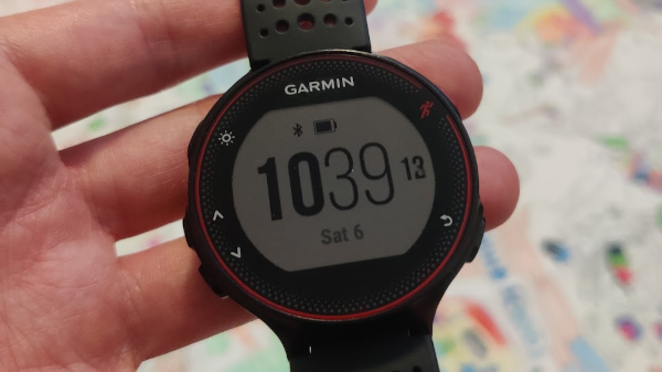
I analyze the data they gather in the Garmin Connect and Strava apps.
This month I wanted to analyze if I have become faster over time given the same effort. For example, I wanted to know if my average pace at an effort of 135 BPM in heart rate had increased or not.
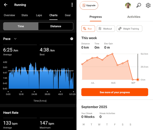
I looked at using Garmin Connect and Strava for this, but couldn't find a way to do it. I pay for Strava, but use the free version of Garmin Connect. I found that Garmin had recently launched a paid subscription called Garmin Connect+ that should, among other things, allow you to do more custom graphs.
But I was not keen on paying for something that maybe supports what I want. And what about when I want to extract some other data from my runs, and Garmin doesn't support it? Why is it so difficult to analyze data that I own in a way that I want?
That's when the familiar though of "How hard can it be to do myself?" hit me and I started researching. I tried to connect my Garmin watch to my computer. It showed up as a USB device. I looked through the files and found a folder with all my activities. There they were. These are the sources I would need to analyze my runs. In a file format called FIT.
I started researching how to process FIT files. Eventually I found that Garmin has a Python SDK garmin-fit-sdk. Nice!
Once I figured out how to process the files (the most uncertain part of this project) it was just a matter of drawing some graphs I though. And it was, but as usual it takes more time than anticipated. But this time, not too long. So I managed to build something that serves my needs. Here is the main screen:
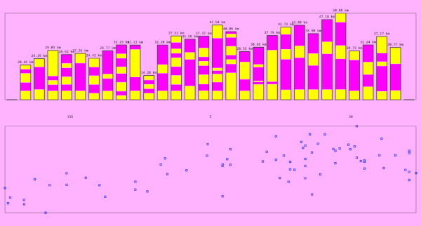
The top part shows an overview of all my runs. My Garmin watch has limited memory, so only the most recent activities are stored. But because I have used the Garmin Connect app for a while, I had uploaded my activities there and was able to download them again and import into my application.
The bottom part is that custom graph that I wanted. I think I can see a trend towards faster average paces. Nice! I can click on a specific run here and a different graph will open:
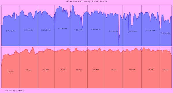
It shows the standard pace and heart rate graphs for a specific run.
I have now stopped paying for Strava, and I think I will also leave their platform soon. For me, it has become more of a distraction than something that provides value.
Timeline
This month I also did some more work on Timeline. The new workflow that my own code hosting platform provides with the addition of building the Windows exe in Wine is just wonderful. I make a change to the code, commit it, and push it. The push triggers a build of the project website and binaries. If the build succeeds, everything is published and the push commands finishes with a success code. I can share the new version instantly. If the build fails, nothing gets published and I have to fix the error found in the output of the push command.
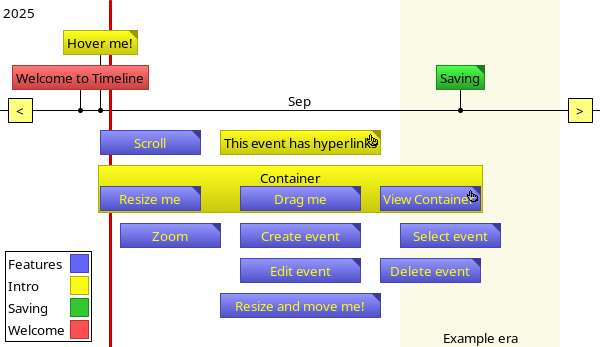
This month a request came in on the mailing list asking if event texts could be drawn outside the event box instead of inside. Here is what the tutorial timeline looks like today:
I thought this was an interesting problem to work on, so I had a look. Implementing this feature required extensive changes in the logic of how a timeline is drawn. I spent quite a bit of time trying to understand the drawing code which I hadn't touched in years. I made many refactorings that I think made the code better in addition to supporting the new feature. Here is how it turned out:
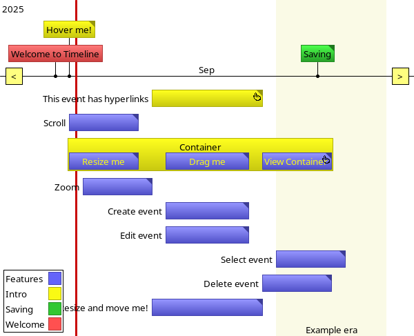
In some timelines, this rendering works better, and there is now a setting in Timeline that allows you to choose which one you want.
This work felt rewarding for many reasons. It was an example of a well functioning feedback loop involving a user. The feedback loop was shorter because of technical improvements in the code hosting platform. And I got do a fun programming task.
What is Rickard working on and thinking about right now?
Every month I write a newsletter about just that. You will get updates about my current projects and thoughts about programming, and also get a chance to hit reply and interact with me. Subscribe to it below.